
Fill style is the setting that changes a word art design more than any other: three buttons in the TextShape editor's Text tool, labeled Flow, Packed, and Outline. Feed them the same two ingredients, a shape and a word list, and you get three completely different pictures. This comparison shows the same star, with the same words, in all three word art fill styles, and what kind of text art each one makes.
The short version first. Flow typesets the words as legible lines trimmed to the shape. Packed builds a dense word cloud, biggest words first, smaller ones interlocking into the gaps. Outline runs the words around the silhouette edge and leaves the inside empty. The choice mostly comes down to whether anyone is supposed to read the words, or just recognize the shape they make.
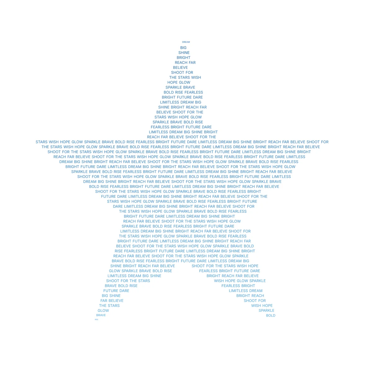
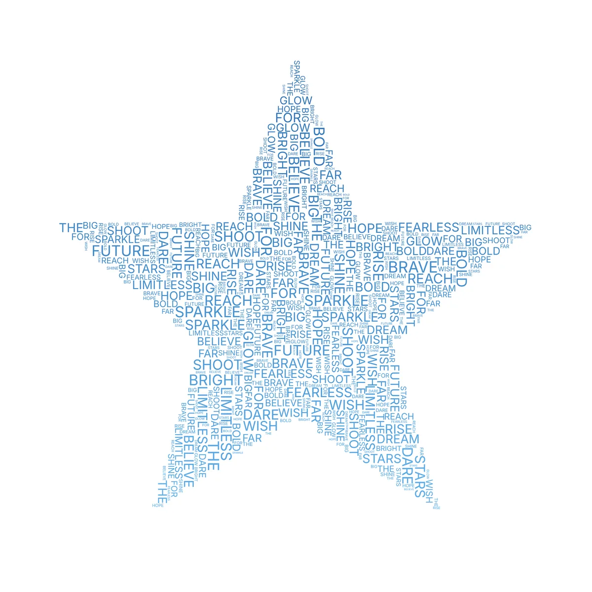
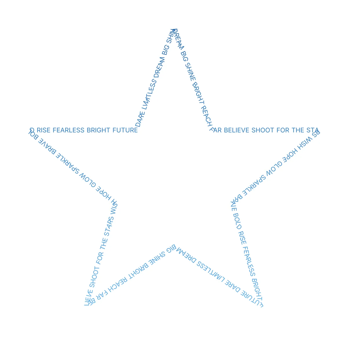
Top to bottom: Flow, Packed, Outline. The shape, the words, the font, and the colors are identical in all three.
The three word art fill styles at a glance
| Fill style | How it fills | Reads like | Best for |
|---|---|---|---|
| Flow | Readable lines clipped to the shape | Ordinary reading order, in a shape | Verses, quotes, anything meant to be read |
| Packed | Biggest words first, smaller ones tucked into every gap | A word cloud locked to the shape | Names, word lists, dense poster art |
| Outline | Words trace the silhouette edge, inside stays empty | A frame drawn out of words | Minimal prints, a name circling a shape |
You can switch between them anytime with one click; the rest of this post shows what each one is for.
Flow fill style: readable lines inside the shape
Flow is the default, and it is the only style built for actual reading. Your text runs in lines, left to right, top to bottom. If your text runs out before the shape is full, it repeats from the start, and each line holds as many words as fit the shape's width at that height. The result reads like a page of text that happens to be star-shaped, or dog-shaped.
Because reading is the point, Flow unlocks the typesetting controls the other styles hide: alignment (left, center, right, justify), line height, and a size gradient that can swell the words toward a point you drag around the canvas. It also has a frequency option: turn on "Size words by frequency" and bigger words are the ones your text repeats most, the classic word-cloud sizing inside readable lines.
Choose Flow when the words arrive in a meaningful order. A Bible verse, or a paragraph from a letter you want kept whole. The Christian word art guide leans on it for scripture, and the animated export can even reveal a Flow design in reading order.
Packed fill style: the interlocking word cloud
Packed is the poster look. The largest words claim their places first, then the packer spirals outward from each word's starting spot until it finds room, testing collisions against the actual letter shapes, not the invisible rectangles around them. That is why a smaller word can nest inside the open center of an O and the fill reaches edge to edge. Smaller and smaller repeats fill the remaining gaps until the silhouette is solid.
Packed has its own control set: a Word size slider, an Orientation switch (horizontal, vertical, or mixed), and a Shuffle layout button that rerolls the arrangement while keeping everything else. Star a word (type it as *NAME) and it renders large throughout. Two options matter for personal pieces: "Use my exact words" places every entry exactly once, and "Keep each line as one entry" holds phrases like SAN ANTONIO together. The layout you settle on is the one that exports; as the export guide explains, exporting rescales your arrangement instead of rebuilding it.
One more trick hides in "More packed options": Invert, which fills everything around the shape instead of the shape itself. The words pack the whole canvas and stop at the silhouette's edge, so your star, or heart, or dog is the empty space they leave behind.
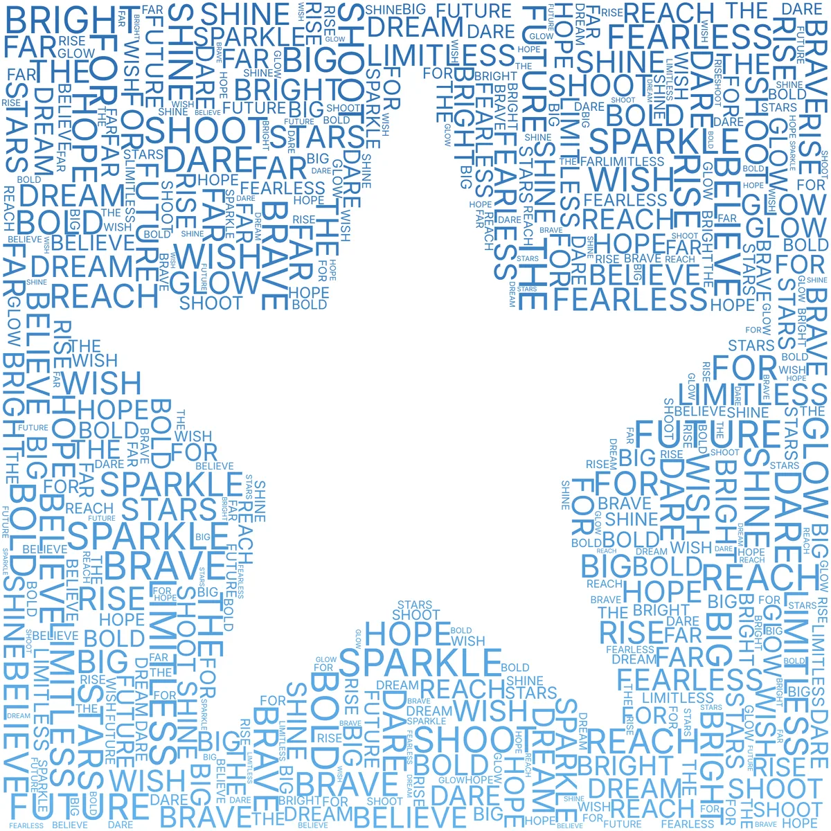
Packed earns its place when the words have no order to preserve, like a year of memories one word at a time. It also rewards a bold, chunky font, since the small filler words nearly disappear in a thin cursive one; the font guide shows the same design in both. If you want frequency to drive the sizing, paste the whole text and follow the word cloud guide. If you are weighing a frequency cloud against hand-picked words, that whole question is the text art vs word cloud comparison.
Outline word art: words that trace the edge
Outline does the opposite of the other two: instead of filling the interior, it draws the silhouette itself out of words. They run along the shape's edge, each letter bending to follow the curve. The words cycle around the whole perimeter and close back on themselves, so the outline reads as one continuous ribbon. If the shape has inner cut-outs, like the hole in a letter or the space inside a wreath, the text traces those too.
It stops being a simple border once you touch the Letter angle slider, which tilts letters relative to the edge: 0 reads along the outline, and at 90 the letters stand perpendicular to it, like teeth on a gear. A separate "Radial words (sunburst)" toggle goes further and turns the whole idea inside out: each word becomes a spoke pointing straight out from the edge, or inward toward the center.
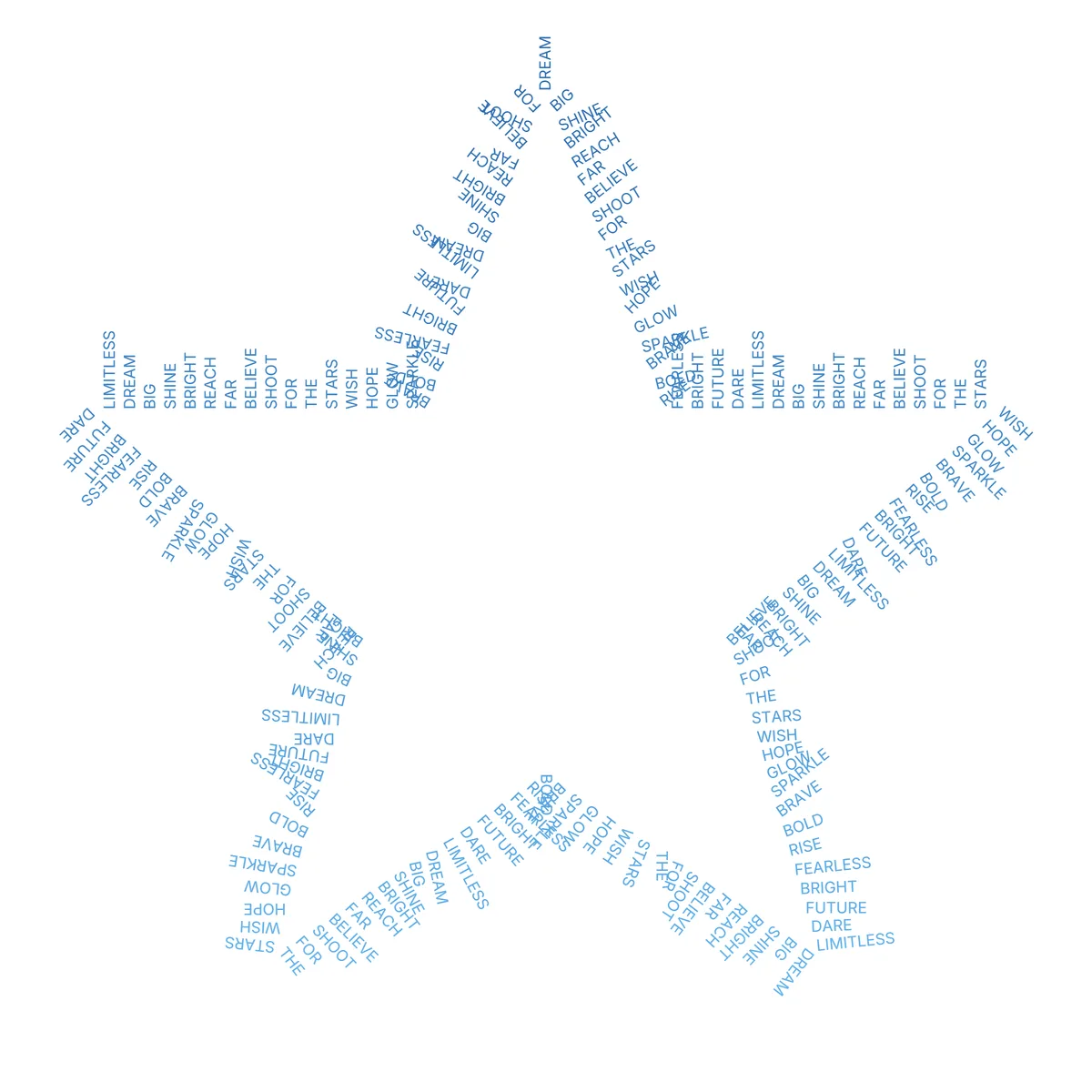
Outline is for pieces where the empty middle does the work: a name around a heart, nothing inside. It works best with one or two words; a short phrase repeated around an edge looks deliberate, while a long paragraph looks crowded.
Switching fill styles: what carries over
The three styles share one silhouette, so switching is one click: the shape and the word list stay, and the layout rebuilds. Colors, gradients, palettes, fonts, and the random per-word tilt in the Effects tool work in all three. The starred words from the Packed section are the exception: only Packed sizes them up, and in Flow and Outline the asterisk is simply ignored, so it never shows up in the art. The frequency choice carries over too; turn it on in Flow, switch to Packed, and it is still on. A few controls only make sense in one style and appear or disappear with it, which is why the Text tool looks different depending on which button is active.
Whichever you land on, the design leaves the editor the same ways: high-resolution PNG, vector SVG, and the animated MP4 or GIF reveal, all covered in the export guide.
Flow vs Packed vs Outline: which to choose
- A verse, a quote, or lyrics someone should actually read: Flow.
- A memorial or roster where every name appears once: Packed, with "Use my exact words" turned on and "Keep each line as one entry" so full names stay whole.
- A dense birthday or anniversary poster from a word list: Packed, with the names starred; the social media ideas post walks through ten ideas along these lines.
- A frequency word cloud in a shape: Flow or Packed, with "Size words by frequency" on; Packed feels most like the classic look.
- A minimalist nursery or wedding print: Outline, with one or two words ringing the edge.
- A poster where the shape is the empty space: Packed, with Invert on.
- A logo-like mark or a sunburst: Outline with Radial words.
My own habit is to try all three before committing; it costs three clicks, and Packed wins most of the time, but the times Outline wins, it wins by a mile. The how to make word art guide walks a full design from blank shape to download, and the free word art generator is where to try your own words. Start with the star template if you want to recreate the comparison above.